 English
 Español
 Português
 Français
 Deutsch
 русский
 한국어
 にほんご
 हिन्दी, हिंदी
 বাংলা
 Bahasa Indonesia
 Türkçe
 Việt
 dansk
 čeština
 עִבְרִית Ivrit
 Filipino/Pilipino
 български език (Bǎlgarski jazik)
 suomi
 norsk
 język polski
 ไทย
 ກະຣຸນາ
 Bahasa Melayu
 ភាសាខ្មែរ
 ဗာရမ်
 اردو
 فارسی
 Italiano
 Nederlands
 svenska
 Монгол хэл
 नेपाली
 සිංහල
 Ўзбек тили
 پښتوتۆرکجه
 Ελληνικά
 српски / srpski
 magyar
 українська
 Kiswahili
 Қазақ тілі
 Română
 Hrvatski
 Bosanski
 Kreyòl ayisyen
 አማርኛ
 Hausa
 Yorùbá
 Igbo
How Do You Specify Custom Warning Text for Barrier Belts?
Specifying custom warning text for barrier belts requires more than sending a sentence and choosing a color. A production-ready specification defines the exact message, language, viewing direction, print size, repeat spacing, belt construction, and approval criteria. The critical distinction is between artwork that looks clear on a screen and a warning that remains readable across an actual access route.
For electrical work areas, the wording must also match the belt’s limited function: communicating a boundary or access restriction. A printed belt does not establish an electrically safe working condition, replace isolation or lockout procedures, provide shock protection, or define a safe approach distance by itself.
Choose the message by the restriction it must communicate
The most useful comparison is not between different slogans, but between different instructions. “Keep Out,” “Authorized Personnel Only,” and “Electrical Work in Progress” communicate different things. Substituting one for another can change how people interpret the boundary.
If crossing is prohibited, the message should state that restriction directly. If entry is permitted only through a controlled process, the wording should reflect that process rather than relying on the broad term “authorized.” A site may distinguish between general access permission and permission to enter a specific work zone.
Do not print “LIVE EQUIPMENT” on a belt intended for unrestricted reuse across different maintenance conditions unless that statement will remain accurate. Equally, wording such as “SAFE WORK AREA” can imply a level of assurance that the belt cannot establish. Reusable messages should describe a reliable restriction, not an equipment condition that changes between jobs.
Signal words such as “DANGER,” “WARNING,” and “CAUTION” should not be selected simply for visual impact. Where the site uses a defined safety-sign system, the signal word, colors, symbols, and message structure should follow its hazard classification and applicable requirements.
Short text versus detailed text: preserve the instruction
A narrow belt has limited vertical space. Adding words without changing the layout forces a trade-off between letter size, spacing, and repeat length. The result can be a complete sentence that cannot be read until someone is already beside the boundary.
A short instruction gives the strongest immediate access-control message. A longer message can explain the hazard, but it needs more horizontal space. Combining several instructions—entry restrictions, protective equipment requirements, contact details, and procedural references—usually makes the belt less effective as a quick visual warning.
The practical choice is to place the essential instruction on the belt and use a separate sign for detailed conditions. For example, a belt might carry a hazard description and “DO NOT ENTER,” while an adjacent sign explains the permit or access arrangement. The sign supplements the belt; it should not be used to justify an ambiguous belt message.
Abbreviations create another trade-off. Familiarity within an electrical maintenance team does not guarantee understanding by visitors, contractors, or delivery personnel. Use abbreviations only where their meaning is established for everyone who may approach the boundary. Saving a few characters is not worthwhile if it weakens the instruction.
Single-language and multilingual layouts need different space
For multilingual sites, translating the message is only part of the specification. Each language needs sufficient size, appropriate orientation, and a clear relationship to the others. A translation should preserve the restriction, not merely reproduce individual words.
Alternating languages along the belt allows each message to use a larger single-line format. However, a short deployed section may show only one language. Stacking two languages makes both available in the same repeat unit, but reduces the vertical space available to each. Separate language-specific belts avoid crowded printing, yet require reliable control over where each version is deployed.
The right choice depends on the shortest expected barrier span and the languages that must be visible at that location. A full-length proof is not enough: review the artwork cropped to the shortest intended deployment. If an essential translation disappears from that view, change the repeat arrangement or use supporting signage.
Have safety-critical translations reviewed by a competent language reviewer familiar with the site terminology. Suppliers should receive approved text, including accents, punctuation, and script direction. Asking the printer to “translate as necessary” leaves an important safety decision outside the approval process.
Specify visibility through dimensions, not descriptions
“Large lettering” and “high visibility” are not measurable production instructions. Specify the finished belt width, usable print area, actual letter height, typeface, colors, and distance between repeated messages. Letter height is more useful than font point size because typefaces with the same nominal point size can produce different visible character sizes.
There is no single letter size that guarantees readability for every installation. Viewing distance, lighting, visual clutter, approach angle, and belt movement all affect recognition. Confirm the design at its intended scale and position rather than judging a magnified artwork preview.
A simple, robust typeface generally provides better recognition than condensed, decorative, or outlined lettering. Narrowing characters may fit a longer sentence into one repeat, but can make individual letters harder to distinguish. Increasing the repeat length or shortening the approved wording is often the better comparison to make.
Color choices should follow the applicable site warning system and provide a clear difference between the text and background. Fluorescent material can improve conspicuity under suitable lighting, but is not the same as retroreflective material. Neither feature compensates for small lettering or poor placement, and visibility in low light needs separate consideration.
Repeat spacing and print direction determine what people actually see
Repeat pitch is the distance from the start of one complete printed unit to the start of the next. It includes the message and the intervening gap. Specifying only “repeat continuously” leaves the supplier to decide how much blank space to insert.
A tight repeat improves the likelihood that a short span contains a complete instruction. A longer repeat can accommodate larger lettering or additional language, but may leave short openings showing only fragments. The acceptance question is whether the shortest intended deployed span presents a complete, understandable message after allowing for the housing, end connector, and layout position.
For a controlled retractable assembly, the start position of the print may help. Where belts are cut from a continuous roll, the cut can fall at different points in the repeat. The supplier should therefore know whether the product is a finished assembly, a replacement belt, or bulk material.
Single-sided printing can be sufficient where approach is possible only from one controlled side. Two-sided printing is more appropriate where people can approach from either direction. It must be genuinely readable on both faces; text showing through from the reverse is not equivalent.
Two-sided artwork also needs an orientation rule. State which edge is the top and show both faces in their deployed positions. “Print both sides the same” can leave room for disagreement about inverted text or the alignment between faces. If twisting is likely, printing alone will not solve the visibility problem; mounting and tension also need attention.
Compare print methods on the finished belt, not by process name
The print process must suit the substrate and the way the belt is used. Screen printing can suit repeated, limited-color artwork on compatible materials. Dye sublimation can suit compatible polyester webbing and more complex designs. Transfer and other surface-printing methods depend on their specific material and process combinations.
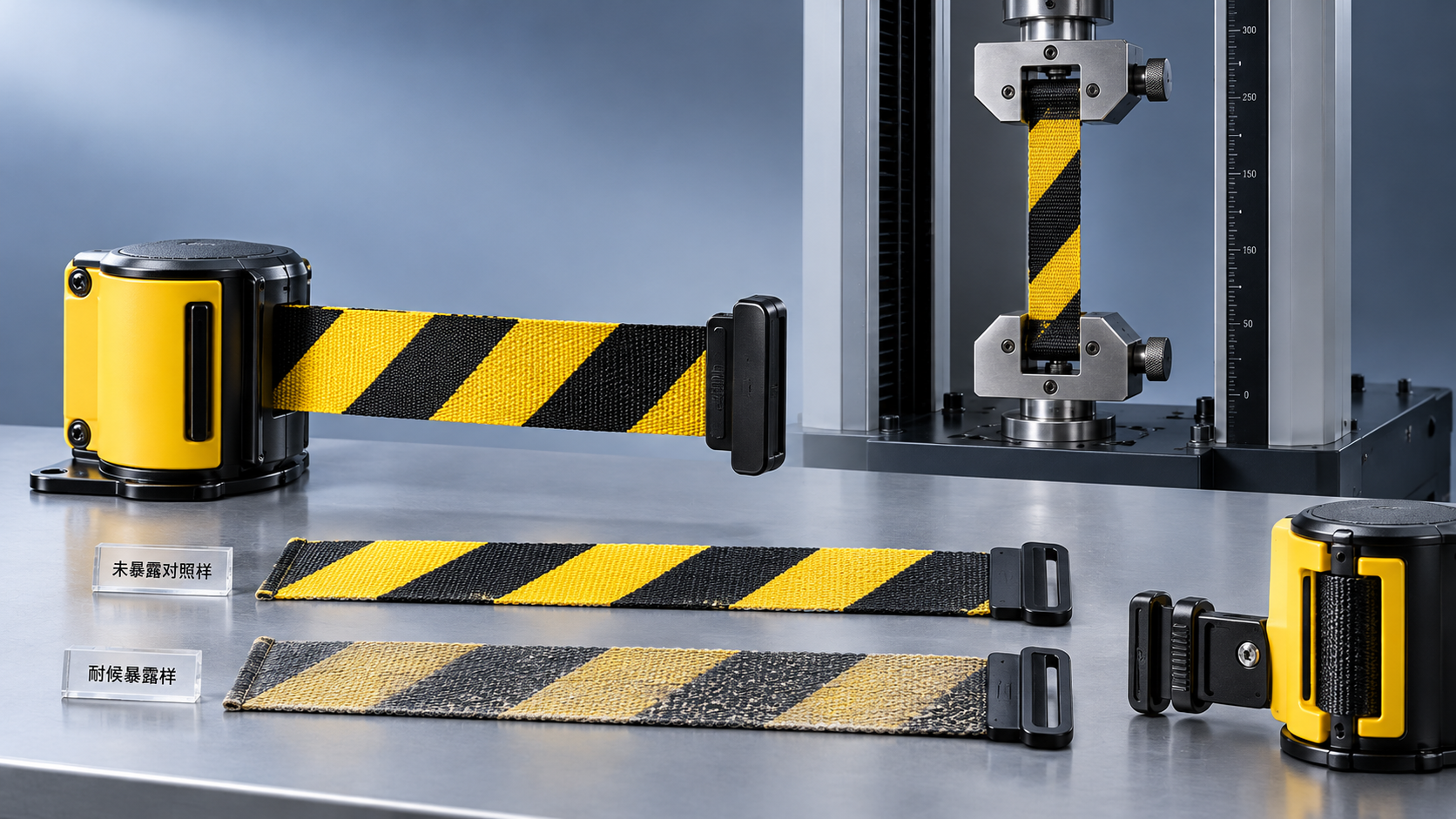
None of these descriptions establishes durability by itself. A warning belt wound repeatedly into a cassette faces different stresses from a stationary printed sample. Surface-applied printing may wear or affect flexibility; colored fibers or printed fabric can still suffer abrasion, fading, or contamination that reduces contrast.
Ask for a sample made using the proposed substrate, ink or coloring system, and finishing process. Evaluate it against the intended exposure: repeated retraction, outdoor sunlight, moisture, handling, or contact with specified cleaning agents. Requirements should identify the relevant conditions and agreed evaluation method rather than simply asking for “weatherproof” printing.
For replacement belts, confirm compatibility with the housing and connector system. Width alone is insufficient: material thickness, coating, edge finish, and printing can affect winding. A correctly worded belt that retracts poorly is not an acceptable substitute.
Turn the approved design into an unambiguous purchase specification
A useful order separates the safety message from the manufacturing details. The message is approved for its intended use; the supplier then confirms that the artwork and construction reproduce it correctly.
An illustrative specification could read:
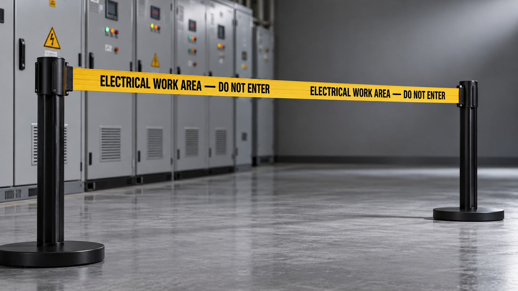
Supply retractable barrier belts using the approved artwork revision. Print the exact text “ELECTRICAL WORK AREA — DO NOT ENTER” on both faces, with each face readable from its respective approach side. Use the belt dimensions, minimum character height, colors, print margins, and repeat pitch shown on the dimensioned drawing. No wording, font substitution, logo addition, or layout change is permitted without written approval. Confirm compatibility with the specified housing and provide a production-equivalent sample before batch release.
The wording is an example, not a universal electrical warning. Its suitability depends on the actual restriction and site assessment. The accompanying drawing must contain real dimensions; referring to a drawing does not resolve missing values.
Where color consistency matters, identify an agreed color reference and the basis for acceptance. Screen previews and office printouts do not reliably represent color on woven material. If a logo is required, give it a defined position and size so it cannot displace the safety instruction during artwork preparation.
A request to “meet international standards” is equally incomplete. Relevant requirements depend on the destination, installation, and warning system. ISO 7010 concerns registered safety signs; ANSI Z535 addresses safety colors, signs, and related communication formats. Referencing either does not automatically establish compliance for a custom printed belt or the complete barrier arrangement. Identify the provisions that actually apply and what evidence is required.
Approve the deployed message, not just the digital proof
A digital proof confirms spelling and layout intent. A production-equivalent sample confirms what that design becomes on the selected material. These approvals serve different purposes and should not be treated as interchangeable.
Check the sample at the shortest and longest intended spans, from each approach direction, under representative lighting. Confirm that a complete instruction remains visible, the reverse face is correctly oriented, and connectors or housings do not obscure essential wording. For retractable products, operate the assembly and inspect the printed surface after the agreed evaluation.
Batch acceptance should distinguish functional defects from minor cosmetic variation. Missing words, incorrect translations, reversed printing, and materially reduced legibility are not merely appearance issues. Record the approved artwork revision, retain an accepted sample, and define how substitutions or changes will be authorized.
The decisive comparison is between a belt that carries the requested words and a belt that reliably communicates the intended restriction. Exact text, dimensioned artwork, appropriate construction, and deployment-based approval are what turn that difference into a controllable manufacturing requirement.
Next:No more content
Recommend
 Oct 30, 2026
How Do You Specify Custom Warning Text for Barrier Belts?
Specify custom warning text barrier belts with confidence. Discover how to choose clear messages, print layouts, and approval criteria for electrical work areas. Get the practical guide.
- Oct 30, 2026
How Can You Verify UV Resistance in Retractable Barrier Belts?
UV resistant retractable barrier belts: learn how to verify weathering reports, retained strength, and assembly performance to compare suppliers and choose with confidence.
- Oct 29, 2026
How Do You Assess Wind Resistance in Outdoor Barrier Stands?
Assess outdoor barrier stand wind resistance with practical tips on bases, ballast, anchors, and gust exposure. Learn how to compare supplier claims and choose the right setup for your site.